
MUIはマテリアルUIの略で、Microsoftが提供しています。
Reactへの導入は比較的容易にでき、導入サンプルも本家サイトに豊富に記載されています。
今回の記事は、MUIの基本的な使い方は本家サイトに譲り、中々分かりにくい下記項目について解説したいと思います。
はじめに
画面の見た目を綺麗に構築するライブラリはいくつもありますが、MUIは中でも抜群に性能が良いと考えています。
今回は、無料利用が可能なMUI coreの中でも、分かりにくい箇所themeを主軸に、導入方法とuseRefの設定方法もあわせて記載したいと思います。
導入
MUIの導入には、下記コマンドを実行します。
ついでに、美麗なアイコンが多い「react-icons」もセットで導入したいと思います。
コマンドプロンプトを起動後、プロジェクトフォルダへ移動します。
その後、下記コマンドを実行します。
※この後もコマンドプロンプトを使用するので、閉じないで下さい。
npm install @mui/material @emotion/react @emotion/styled @mui/icons-material react-iconsインストールしたコンポーネントの参照先ドキュメントは、下記になります。
| 項目 | URL |
|---|---|
| MUI | https://mui.com/ |
| MUIアイコン | https://mui.com/material-ui/material-icons/ |
| reactアイコン | https://react-icons.github.io/react-icons/ |
MUIは、公式ドキュメントにサンプルが大量に掲載されているので、慣れるまでは頻繁に確認する事になるでしょう。
また、reactアイコンも何かと検索する事が多いので、併せてブックマークしておくと作業が捗りますよ。
Theme
Themeとは、デフォルトで設定されている各種スタイルを、自由にカスタマイズできるものです。
先ずは、createTheme()にてオリジナルのテーマを作っていきましょう。
import { createTheme } from '@mui/material';
const theme = createTheme({
});
export default theme;
作成したThemeは、TemeProvider()に設定します。
※基本はindex.tsxに組み込む形で良いです。今回はたまたまApp.tsxに組み込みました。
以降、関数「App()」に配置した子要素(以下孫要素含む)達は、設定したThemeに従って画面描画を行います。
※CssBaselineは、MUIが用意したリセットCSSになります。
import './App.css';
import Sample from 'Sample';
import { CssBaseline, ThemeProvider } from '@mui/material';
import theme from 'theme';
function App() {
return (
<ThemeProvider theme={theme}>
<CssBaseline/>
<div className="App">
<Sample />
</div>
</ThemeProvider>
);
}
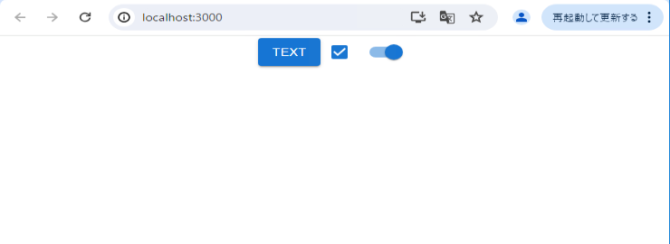
export default App;先ずはサンプルとして、ボタン・チェックボックス・スイッチを使用します。
Themeに何も記載がないので、この段階ではデフォルトスタイルで表示しています。
import {Button,Checkbox,Switch } from '@mui/material';
function Sample() {
    return (
        <div>
            <div>
                <Button variant="contained">Text</Button>
                <Checkbox defaultChecked />
                <Switch defaultChecked />
            </div>
        </div>
    )
}
export default Sample;
画面の確認になります。
配置しただけなのに、綺麗な見た目ですよね。
次より、Themeの設定を行っていきたいと思います。
palette
「palette」は、コンポーネントの色を指定できます。
先ずはサンプルになります。
import { createTheme } from '@mui/material';
import { orange } from '@mui/material/colors';


// カスタムカラーの設定
declare module '@mui/material/styles' {
    interface Palette {
        sample: Palette['primary'];
    }
    interface PaletteOptions {
        sample?: PaletteOptions['primary'];
    }
}
declare module '@mui/material' {
    interface ButtonPropsColorOverrides {
        sample: true;
    }
    interface CheckboxPropsColorOverrides {
        sample: true;
    }
    interface SwitchPropsColorOverrides {
        sample: true;
    }
}

const theme = createTheme({
    palette: {
        mode: 'light', // dark or light 表示モード
        primary: {
            main: '#1976d2',
            light: '#42a5f5',
            dark: '#1565c0',
            contrastText: '#fff'
        },
        secondary: orange,
        sample: {
            main: '#378030',
            light: '#53BF49',
            dark: '#2C6627',
            contrastText:'#fff'
        }
    }
});
export default theme;
サブセクション(左のテーブル)と、各サブセクションのプロパティ(右のテーブル)になります。
下記以外にもオリジナルのサブセクションを作成する事が可能です。
※上記サンプルの「sample」がオリジナルのサブセクションになります。
| サブセクション | 説明 |
|---|---|
| primary | デフォルト(メイン)カラー |
| secondary | サブカラー |
| error | エラー表示時のカラー |
| warning | 警告表示時のカラー |
| info | 情報表示時のカラー |
| success | 成功時のカラー |
| プロパティ | 説明 |
|---|---|
| main | メインカラー |
| light | ライトモードでのカラー |
| dark | ダークモードでのカラー |
| contractText | テキストカラー |
配色が分かりやすいように、コンポーネントを増やし「secondary」と「sample」の設定を行いました。
import {Button,Checkbox,Switch } from '@mui/material';
function Sample() {
    return (
        <div>
            <div>
                <Button variant="contained">Text</Button>
                <Checkbox defaultChecked />
                <Switch defaultChecked />
            </div>
            <div style={{marginTop: 10}}>
                <Button variant="contained" color='secondary'>Text</Button>
                <Checkbox defaultChecked color='secondary'/>
                <Switch defaultChecked color='secondary'/>
            </div>
            <div style={{marginTop: 10}}>
                <Button variant="contained" color='sample'>Text</Button>
                <Checkbox defaultChecked color='sample' />
                <Switch defaultChecked color='sample' />
            </div>
        </div>
    )
}
export default Sample;
各コンポーネントに設定した配色(primary,secondary,sample)を確認します。
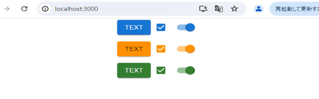
各コンポーネントが、指定した配色(青色、オレンジ色、緑色)で表示されています。
typography
「typography」は、コンポーネントのフォントと文字サイズを設定します。
ついでに新規フォントを追加します。
下記サイトより2つのフォント「Crimson Pro」と「Note Sans」を探して、インストールしましょう。

下記が、2つのフォントのインストールコマンドになります。
導入時に使用したコマンドプロンプトが残っていれば、そこから実行して下さい。
※閉じている場合は、起動した後プロジェクトフォルダに移動してください。
npm install @fontsource/crimson-pro @fontsource/noto-sans-jpインストールしたフォントをインポートします。
import { createTheme } from '@mui/material';
import "@fontsource/crimson-pro";
import '@fontsource/noto-sans-jp';

const theme = createTheme({
    typography: {
        fontFamily: [
            '"Crimson Pro"',
            '"Noto Sans JP"',
            'sans-serif',
            '"Myrica M"',
            '"Moralerspace Neon HW"'
        ].join(','),
        fontSize: 15,
    },
});
export default theme;
「typpography」で設定する項目は下記になります。
| サブセクション | 説明 |
|---|---|
| fontFamily | 文字の種類 |
| fontSize | 文字の大きさ(デフォルト14px) |
| htmlFontSize | HTMLのデフォルトフォントサイズを指定する |
| fontWeightRegular | sxで’fontWeight’を’regular’を指定した時の太さを指定する (デフォルト値) |
| fontWeightMedium | sxで’fontWeight’を’medium’を指定した時の太さ指定する |
| fontWeightBold | sxで’fontWeight’を’bold’を指定した時の太さ指定する |
| fontWeightLight | sxで’fontWeight’を’light’を指定した時の太さ指定する |
variant
「variant」は、UIの見た目をパラメータ「variant」で設定する事で、細かく変更する事が可能です。
下記サンプルの「sample」はオリジナルで作成した「variant」になります。
import { createTheme } from '@mui/material';
import "@fontsource/crimson-pro";
import '@fontsource/noto-sans-jp';
// オリジナルvariantの設定用
declare module "@mui/material/styles" {
interface TypographyVariants {
sample: React.CSSProperties;
}
// allow configuration using `createTheme`
interface TypographyVariantsOptions {
sample?: React.CSSProperties;
}
}
// Update the Typography's variant prop options
declare module "@mui/material/Typography" {
interface TypographyPropsVariantOverrides {
sample: true;
}
}
const theme = createTheme({
typography: {
fontFamily: [
'"Crimson Pro"',
'"Noto Sans JP"',
'sans-serif',
].join(','),
fontSize: 15,
subtitle1:{
fontSize: '1.5rem',
fontFamily: 'Arial',
fontStyle: 'italic',
fontWeight: 500
},
body1:{
fontFamily: 'Segoe UI Symbol',
},
sample: {
fontWeight: 500,
color: 'red',
fontSize: 30,
fontFamily: 'BlinkMacSystemFont',
},
h3: undefined // バリアントを無効化
},
});
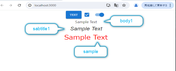
export default theme;Typographyのvariantに「body1」「subtitle1」「sample」を設定します。
※「body1」はTypographyのデフォルトバリアントです。
import {Button,Checkbox,Switch,Typography} from '@mui/material';
function Sample() {
    return (
        <div>
            <div>
                <Button variant="contained">Text</Button>
                <Checkbox defaultChecked />
                <Switch defaultChecked />
                <Typography>Sample Text</Typography>
                <Typography variant='subtitle1'>Sample Text</Typography>
                <Typography variant='sample'>Sample Text</Typography>
            </div>
        </div>
    )
}
export default Sample;
Typographyの文字「Sample Text」が、設定したvariantにより変化している事が分かります。
設定可能なvariantは、下記の13種になります。
spacing
「spacing」は、UI間のすき間を設定します。
コンポーネントのパラメータ「sx」を指定した時の設定値に影響を与えます。
import { createTheme } from '@mui/material';

const theme = createTheme({
    spacing: 2
});
export default theme;
コンポーネントへの指定方法
themeの「spacing値」と、「sxで設定した値」をかけた数値のすき間を設定します。
<Box sx={{m:2}}>bbb</Box> // margin: 2 * 2 = 4px
<Box sx={{p:3}}>bbb</Box> // padding: 2 * 3 = 6px;
sxの設定は、「余白の種類(margin、padding)」と「余白の位置(top, right等 任意)」の組み合わせになります。
組み合わせの種類としては下記14種となります。
breakpoints
「breakpoints」は、レスポンシブにスタイルを設定します。
breakpointsのサンプルになります。
xs,xl等を廃止し、mobile, desktop等を新規で追加し、各設定項目に対し、画面幅を指定しています。
import { createTheme } from '@mui/material';

declare module '@mui/material/styles' {
    interface BreakpointOverrides {
        xs: false; // removes the `xs` breakpoint
        sm: false;
        md: false;
        lg: false;
        xl: false;
        mobile: true; // adds the `mobile` breakpoint
        tablet: true;
        laptop: true;
        desktop: true;
    }
};
const theme = createTheme({
    breakpoints:{
        values:{
            mobile: 0, // adds the `mobile` breakpoint
            tablet: 640,
            laptop: 1024,
            desktop: 1200,
        }
    }
});
export default theme;
「breakpoints」の指定方法です。
画面幅に対し、背景色と文字の表示/非表示を切り替えています。
import { Typography } from '@mui/material';
import { styled } from '@mui/material/styles';
import { red, green, blue, orange } from '@mui/material/colors';

const Wrap = styled('div')(({ theme }) => ({
    padding: theme.spacing(1),
    [theme.breakpoints.up('mobile')]: {
        backgroundColor: orange[500], // ブラウザのwidth= 0px ~
    },
    [theme.breakpoints.up('tablet')]: {
        backgroundColor: red[500], // ブラウザのwidth= 640px ~
        color: '#FFF'
    },
    [theme.breakpoints.up('laptop')]: {
        backgroundColor: blue[500], // ブラウザのwidth= 1023px ~
    },
    [theme.breakpoints.up('desktop')]: {
        backgroundColor: green[500], // ブラウザのwidth= 1200px ~
    },
}));

function Sample() {
    return (
        <Wrap>
            <Typography>abc</Typography>
            <Typography sx={{display: {mobile:'none', laptop:'block'}}}>出現</Typography>
        </Wrap>
    )
}
export default Sample;
■mobile 画面幅「~ 639px」
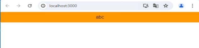
■tablet 画面幅「640px ~ 1023px」
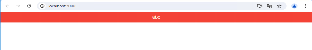
■laptop 画面幅「1024px ~ 1199px」
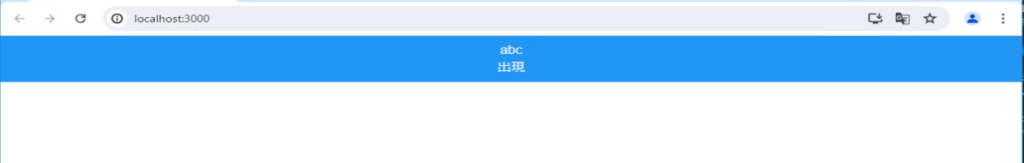
■desktop 画面幅「1200px ~」
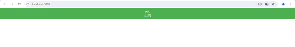
画面幅に合わせて、変化している様子が分かります。
この機能を利用して、端末や機種ごとに見え方を変える事が可能になります。
zIndex
「zIndex」は、各コンポーネントのz軸(重なり具合)を調整する項目になります。
下記は、各コンポーネントの初期値になります。
| コンポーネント名 | zIndex初期値 |
|---|---|
| mobile stepper | 1,000 |
| fab | 1,050 |
| speed dial | 1,050 |
| app bar | 1,100 |
| drawer | 1,200 |
| modal | 1,300 |
| snackbar | 1,400 |
| tooltip | 1,500 |
滅多に変える事は無いと思いますが、いざと言う時に知識として知っておくと良いです。
transitions
「transitions」は、cssをカスタマイズでき「durations」「easings」を変更できます。
APIを利用して、UIの要素に変更を行います。
theme.transitions.create(props, options) => transition「transitions」の使用のサンプルになります。
APIを使用し、カスタマイズしています。
import { Button } from '@mui/material';
import { styled } from '@mui/material/styles';

const CustomBtn = styled(Button)`
    ${ ({ theme }) => `
        cursor: crosshair;
        opacity: 0.2;
        margin-top: 30px;
        background-color: ${theme.palette.secondary.dark};
        transition: ${theme.transitions.create(
            [
                'background-color',
                'margin-top',
                'opacity',
                'transform'
            ],
            {
                delay: '100ms',
                duration: theme.transitions.duration.standard,
                easing:theme.transitions.easing.easeIn,
            }
        )};
        &:hover {
            transform: scale(1.4);
            background-color: ${theme.palette.success.main};
            margin-top: 35px;
            opacity: 1;
        }
    `}
`;

function Sample() {
    return (
        <CustomBtn variant='contained'>ボタン</CustomBtn>
    )
}
export default Sample;
「duration」「easing」は、themeで初期値が設定されていますが、themeの設定によって変更可能です。
duration
| プロパティ名 | 初期値 |
|---|---|
| shortest | 150 |
| leavingScreen | 195 |
| shorter | 200 |
| enteringScreen | 225 |
| short | 250 |
| standard | 300 |
| complex | 375 |
easing
| プロパティ名 | 初期値 |
|---|---|
| easeInOut | cubic-bezier(0.4, 0, 0.2, 1) |
| easeOut | cubic-bezier(0.0, 0, 0.2, 1) |
| easeIn | cubic-bezier(0.4, 0, 1, 1) |
| sharp | cubic-bezier(0.4, 0, 0.6, 1) |
shape
「shape」は、UIの隅を指定します。
「shape」のサンプルになります。
borderRadiusの値を大きくすると、UIの角が丸くなっていきます。
import { createTheme } from '@mui/material';

const theme = createTheme({
    shape: {
        borderRadius: 15
    }
});
export default theme;
components
「components」は、コンポーネントのスタイルや、デフォルトのプロパティを変更できます。
また、独自のバリアントも設定可能です。
システム全体で共通の変更を行いたい場合、ここで設定を行うイメージになると思います。
「components」のサンプルになります。
import { createTheme } from '@mui/material';

declare module '@mui/material/Button' {
    interface ButtonPropsVariantOverrides {
        sample: true;
    }
}

const theme = createTheme({
    components:{
        MuiButtonBase:{
            defaultProps: {
                centerRipple: false
            },
            styleOverrides: {
                // Name of the slot
                root: {
                    cursor: 'zoom-in',
                }
            },
        },
        MuiButton:{
            variants: [
                {
                    props: { variant: 'sample' },
                    style: {
                        border: '1px solid blue'
                    }
                }
            ]
        }
    }
});
export default theme;useRefの使い方
MUIは、目的のUIに様々なラッピングを行って見た目を変更しています。
そのため、useRefを通常通りに使用してしまうと、目的のHTML要素が取得できません。
取得出来るのは、<input>をラップしいた「外側の<div>要素」を取得します。
下記サンプルは、「TextField」に通常通りにuseRefを設定しました。
useRefの中身をconsole.logで出力し、確認してみましょう。
import { TextField } from '@mui/material';
import { useRef, useState } from 'react'

function Sample() {
    const iptRef = useRef<HTMLInputElement>(null);
    const [text, setText] = useState<string>('テキスト');

    if ( iptRef.current !== null ){
        console.log(iptRef.current);
    }

    return (
        <TextField
            ref={iptRef}
            variant='outlined'
            value={text}
            onChange={(e) => setText(e.target.value)} />
    )
}
export default Sample;
サンプル画面とDOMを確認してみます。
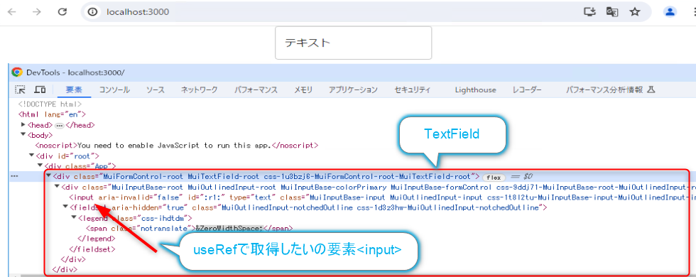
TextFieldは、<input>をラッピングしている<div>全体を指しています。
useRefで取得する対象のHTML要素は、内部にある<input>要素です。
では、useRefに何が格納されるのか確認してみましょう。
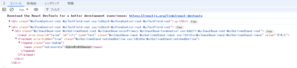
案の定、外側の<div>要素がuseRefに格納されていました。
このまま無理やり使用しても問題ありませんが、やはり効率が悪いです。
useRefの正しい設定方法
<input>要素にuseRefを設定したい場合は、「inputRef」を使用します。
先ほどのサンプルから、「ref => inputRef」に変更しています。
import { TextField } from '@mui/material';
import { useRef, useState } from 'react'

function Sample() {
    const iptRef = useRef<HTMLInputElement>(null);
    const [text, setText] = useState<string>('テキスト');

    if ( iptRef.current !== null ){
        console.log(iptRef.current);
    }

    return (
        <TextField
            inputRef={iptRef}
            variant='outlined'
            value={text}
            onChange={(e) => setText(e.target.value)} />
    )
}
export default Sample;
console.logを確認してみます。

今度は正常に<input>要素をuseRefに格納する事が出来ました。
おわりに
MUIの導入とthemeしか触れていませんが、一旦ここで記事を終了したいと思います。
実際、様々なコンポーネントを導入する際、本家のURLからサンプルを参照した方が正確で正しいコーディングが行えます。
ここでは、本家で拾いにくい項目に対して紹介いたしました。
後は使い慣れれば、割と簡単に導入出来ちゃいます。